
Finding the right variable
Running notebook: Investigation progress
- Getting hold of the data with a tool found on GitHub
- Understanding relational databases and how to load your data
- Structuring your workflow
After weeks of teasing, this is finally it: we are about to start analysing some of the data.
And no, I did not add five preliminary chapters just to keep you waiting. Real data projects often take time before the first graph appears. We needed to find the data, understand how they were stored, bring them into R, and build a reproducible workspace. We now have solid foundations.
Let’s go!
A question I wasn’t planning to ask
As I wrote in the preamble to this notebook, data analysis is rarely a straight line. Every anaysis takes some detours. This chapter documents one of these.
I originally expected this first exploration to be about progress. Am I running faster? Is my fitness improving?
By then, another question had become more pressing. Over the previous week, I had felt increasingly tired. I was still reaching the targets set by the programme, but my energy on the days following each session was lower than expected. And yet, I did not think my pace targets had increased significantly.
So my first question for the data became: After my long break from running, had I been doing too much, too quickly?
Sleep, nutrition, and work had been fairly constant. I therefore started by looking at the training, while keeping in mind that it might not be the only explanation.
The question was simple. But translating it into data was harder. Which variable represents doing too much? Pace? Effort? Distance? Something else?
Dozens of variables were waiting in the activities table alone, which
sounded like plenty. But having lots of variables does not mean having
the right one. The database contains what Garmin was designed to record,
not necessarily what I needed to answer my question.
This is where exploratory data analysis (“EDA”) begins. Rather than plotting every available column and hoping for a pattern, we need to find -or engineer- a variable that actually addresses the question.
Answering it required more than a surface understanding of both the data and the problem.
A reproducible start
As discussed in the last chapter (A place for everything), I begin every analysis by defining its environment. I am showing the setup again for consistency, but I won’t re-explain the details.
# ---- Ready the tools ----
library(dbplyr)
library(dplyr)
library(fs)
library(ggplot2)
library(stringr)
library(tidyr)


# ---- Locate the headquarters ----
setwd(
    path(path_home(), "DataSharp", "enter-the-mind", "running")
)


# ---- Describe the project ----
dir_inputs  <- path("_inputs")
dir_outputs <- path("_outputs")

dir_out_figures  <- path(dir_outputs, "figs")
dir_out_datasets <- path(dir_outputs, "data")

dir_create(c(dir_outputs, dir_out_figures, dir_out_datasets))


# ---- Open the database connection ----
con <- DBI::dbConnect(
    RSQLite::SQLite(),
    dbname = path(
        dir_inputs,
        "DBs",
        "garmin_activities.db"
    )
)
Before opening R, I also run the following command to update the databases with my latest Garmin data:
cd Programs/garmindb
uv run garmindb_cli.py --all --download --import --analyze --latest
Then I collect the runs completed since the programme began:
runs <-
    tbl(con, "activities") |>
        filter(
            sport == "running",
            start_time >= "2026-06-29"
        ) |>
        collect()
At the time of writing, I have completed 14 runs. Each data point has been hard-earned, but these observations are still very few. It is too early, for instance, to make credible performance predictions. This investigation only asked whether something obvious had changed in recent weeks.
Dozens of variables, but not the right ones
Garmin knows when I ran, how far I went, how fast my heart was beating, and much more. But it does not know how those runs fit into my training programme.
This context matters. My programme contains two sessions per week: usually one longer run and one more intense session, such as tempo intervals or hill repeats. Some weeks are deliberately lighter to favour recovery (“deload” weeks).
Before analysing them, I needed to create a few variables that related the runs to my question:
dateextracts the calendar date from Garmin’s timestamp;training_weekplaces each run within the programme;session_typeseparates long runs, tempo sessions, hill sessions, and the time trial;deloadidentifies the lighter recovery weeks;avg_paceconverts speed in kilometres per hour into the more familiar minutes per kilometre.
runs <-
    runs |>
        arrange(start_time) |>
        mutate(
            run_id = row_number(),
            date = as.Date(start_time),
            training_week = as.integer(date - min(date)) %/% 7 + 1,
            session_type = case_when(
                str_detect(name, "Time Trial") ~ "Time trial",
                str_detect(name, "Hills")      ~ "Hills",
                str_detect(name, "Tempo")      ~ "Tempo",
                str_detect(name, "Long Run")   ~ "Long run",
                TRUE                           ~ "Short & Slow"
            ),
            deload = if_else(
                training_week %in% c(4, 7),
                "Deload",
                "Regular"),
            avg_pace = 60 / avg_speed
        )

runs |>
    select(
        run_id,
        date,
        training_week,
        session_type,
        deload,
        distance,
        avg_pace
    )
## # A tibble: 14 × 7
##    run_id date       training_week session_type deload  distance avg_pace
##     <int> <date>             <dbl> <chr>        <chr>      <dbl>    <dbl>
##  1      1 2026-06-29             1 Long run     Regular     7.52     6.35
##  2      2 2026-07-02             1 Hills        Regular     6.39     6.22
##  3      3 2026-07-06             2 Long run     Regular     7.01     6.02
##  4      4 2026-07-09             2 Tempo        Regular     6.16     5.87
##  5      5 2026-07-13             3 Long run     Regular     9.09     5.72
##  6      6 2026-07-17             3 Hills        Regular     7.65     6.44
##  7      7 2026-07-20             4 Long run     Deload      6.01     7.03
##  8      8 2026-07-23             4 Time trial   Deload      5.55     5.52
##  9      9 2026-07-28             5 Long run     Regular    10.0      5.54
## 10     10 2026-07-31             5 Tempo        Regular     6.63     5.61
## 11     11 2026-08-03             6 Long run     Regular    11.0      5.80
## 12     12 2026-08-06             6 Hills        Regular     9.35     6.49
## 13     13 2026-08-11             7 Short & Slow Deload      6.49     7.44
## 14     14 2026-08-13             7 Short & Slow Deload      4.01     7.07
This is feature engineering in its simplest form: translating my
knowledge of the project into variables the computer can use. Some
variables add context that Garmin does not have, while others transform
existing measurements into more useful units, such as pace instead of
speed.
Feature engineering can be part of preparing data for analysis. More importantly here, it determines which questions the data can answer.
Do not let the available columns dictate your questions. If the variable you need is missing, take time to build it.
First candidate: average pace
My first candidate was average pace. If the recent sessions had been too demanding, perhaps I had simply been running too fast for my current level.
runs |>
    ggplot() +
        aes(
            x = date, y = avg_pace,
            colour = session_type, shape = deload
        ) +
        geom_line(aes(group = 1), colour = "grey75") +
        geom_point() +
        scale_y_reverse() +
        labs(
            x = NULL,
            y = "Average pace (min/km)"
        )
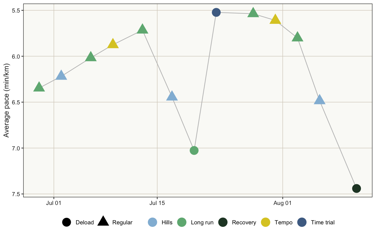
Pace improved quickly during the opening weeks before settling somewhere around 5’30 to 5’50 per kilometre.
Five apparently slow runs stand out. Two were hill sessions, which included hard uphill repetitions followed by walking recovery. Their average pace makes them look easy when they were anything but. The other three came from recovery weeks and were meant to be slow. In particular, the final two were part of my response to the accumulated fatigue: an easy week with two short, slow runs.
An unusual observation is not necessarily an error. An outlier may be a data problem, or it may be a genuine observation. Understand where it comes from before deciding what to do with it.
This was useful, although it was not the answer I was looking for. Once I set the deload runs aside, there was no recent increase in average pace. If anything, I had slowed down slightly. Average pace was therefore a poor explanation for my fatigue.
But average pace is also an imperfect representation of a run. The same average can describe a steady effort, intervals, or short sprints separated by walking. Before discarding pace entirely, I wanted to see what the average was hiding.
Is the average the right summary?
Up to that point, I had used the activities table, which contains one
summary for each recorded activity. Another table, activity_records,
contains the measurements used to create those summaries.
This table cannot be filtered by sport == "running" as before because
that column is not included there, but activity_id connects it to my
runs. An inner_join() retains only the records belonging to both
tables.
runs_detailed <-
    runs |>
        inner_join(
            tbl(con, "activity_records") |>
                collect(),
            by = "activity_id"
        ) |>
        filter(speed > 0) |>
        mutate(pace = 60 / speed) |>
        arrange(date, record)
Each row now represents one measurement recorded during a run of my programme. I removed records where speed equals zero because pace is undefined when there is no movement.
runs_detailed |>
    ggplot() +
        aes(
            y = date, x = pace,
            group = activity_id, fill = session_type
        ) +
        geom_violin(width = 5.4, alpha = 0.65) +
        geom_point(
            data = runs,
            aes(y = date, x = avg_pace),
            inherit.aes = FALSE,
            shape = 23,
            size = 3,
            fill = "white"
        ) +
        scale_x_reverse() +
        coord_cartesian(xlim = c(12, 3)) +
        labs(
            y = NULL,
            x = "Pace (min/km)",
            fill = "Session type"
        )
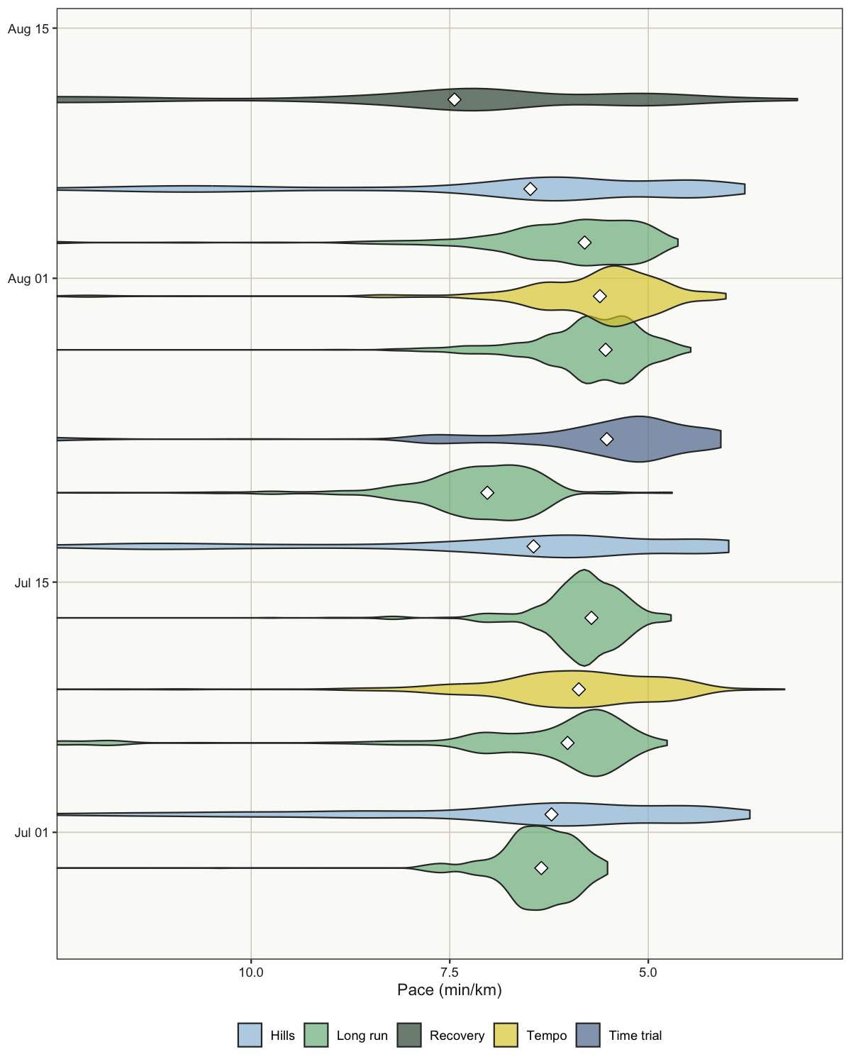
Each violin represents the distribution of pace measurements within one run: the wider it is, the more time I spent running around that pace. The white diamond is the average shown in the previous graph. I limited the visible range to 3–12 min/km so that brief stops do not flatten the useful part of the distributions.
The warm-up and cool-down included at the beginning and end of each session add some noise to these plots. We will deal with them in a future chapter, but since they are fairly similar across sessions, they do not change the message here.
Now the structure of each run becomes visible. Long runs have a fairly narrow distribution, while hill sessions contain several distinct paces: short uphill efforts, recovery running, and some walking.
The graph explains why average pace can misrepresent some sessions. But it did not explain why I had been feeling more tired. This detour gave me a useful lesson: I did not need more data; I needed a better variable for the question.
Second candidate: Garmin’s effort metrics
If pace could not represent how demanding these sessions were, perhaps Garmin’s ready-made effort metrics could.
These are engineered variables too. Garmin combines raw measurements into convenient scores according to its own definition of effort. That can be useful, but a variable does not necessarily become relevant to my question simply because it is already available.
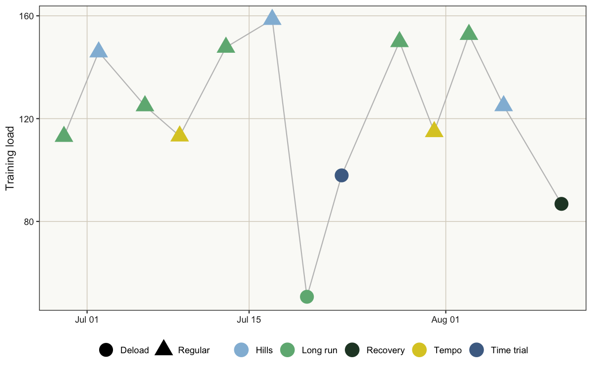
training_load estimates the physiological load created by each
activity. Here, the slow hill sessions no longer look easy. They sit
comfortably among the more demanding runs, while the deload sessions are
at the bottom.
runs |>
    ggplot(
        aes(
            x = date,
            y = training_load,
            colour = session_type,
            shape = deload
        )
    ) +
        geom_line(aes(group = 1), colour = "grey75") +
        geom_point() +
        labs(
            x = NULL,
            y = "Training load"
        )
I also looked at training_effect, which Garmin expresses on a scale
from 1 (a minor effect) to 5 (overreaching). The long runs from weeks 5
and 6 both sit above 4, so the data certainly agree that these were
challenging sessions.
runs |>
    ggplot(
        aes(
            x = date,
            y = training_effect,
            colour = session_type,
            shape = deload
        )
    ) +
        geom_line(aes(group = 1), colour = "grey75") +
        geom_point() +
        labs(
            x = NULL,
            y = "Training effect",
            colour = "Session type",
            shape = "Deload week"
        )
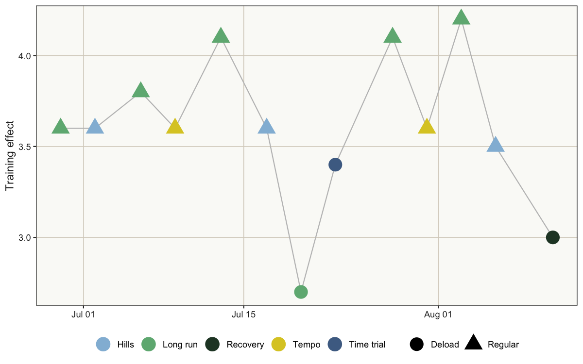
These variables were closer to the idea of effort, but neither showed a clear change. Week 3 had been demanding too, and I had handled it without unusual fatigue.
This second route did not provide an answer either. It did, however, expose another problem: both metrics still described one run at a time.
Fatigue, however, can accumulate across several sessions. Perhaps I didn’t need another variable from the database. Perhaps I needed to engineer one at the level of the training week.
Engineering the variable I needed
To represent accumulated training, I summarised the runs by week. This changed the unit of observation: instead of one row per run, I now had one row per training week.
weekly_runs <-
    runs |>
        group_by(training_week, deload) |>
        summarise(
            n_runs = n(),
            total_distance = sum(distance),
            total_training_load = sum(training_load),
            avg_training_effect = mean(training_effect),
            .groups = "drop"
        ) |>
        arrange(training_week) |>
        mutate(
            distance_change =
                100 * (total_distance / lag(total_distance) - 1)
        )

weekly_runs |>
    select(
        training_week,
        total_training_load,
        avg_training_effect,
        total_distance,
        distance_change
    )
## # A tibble: 7 × 5
##   training_week total_training_load avg_training_effect total_distance
##           <dbl>               <dbl>               <dbl>          <dbl>
## 1             1                259.                3.6            13.9
## 2             2                238.                3.7            13.2
## 3             3                306.                3.85           16.7
## 4             4                149.                3.05           11.6
## 5             5                265.                3.85           16.7
## 6             6                278.                3.85           20.4
## 7             7                121.                2.65           10.5
## # ℹ 1 more variable: distance_change <dbl>
The summarise() step creates several weekly variables from the
individual runs. Training load and training effect do not stand out
compared with week 3. One thing does: training volume, represented here
by total_distance.
weekly_runs |>
    ggplot() +
        aes(
            x = training_week, y = total_distance,
            fill = deload
        ) +
        geom_col() +
        geom_text(
            aes(label = round(total_distance, 1)),
            vjust = -0.5
        ) +
        scale_x_continuous(breaks = weekly_runs$training_week) +
        expand_limits(y = 22) +
        labs(
            x = "Training week",
            y = "Total distance (km)"
        )
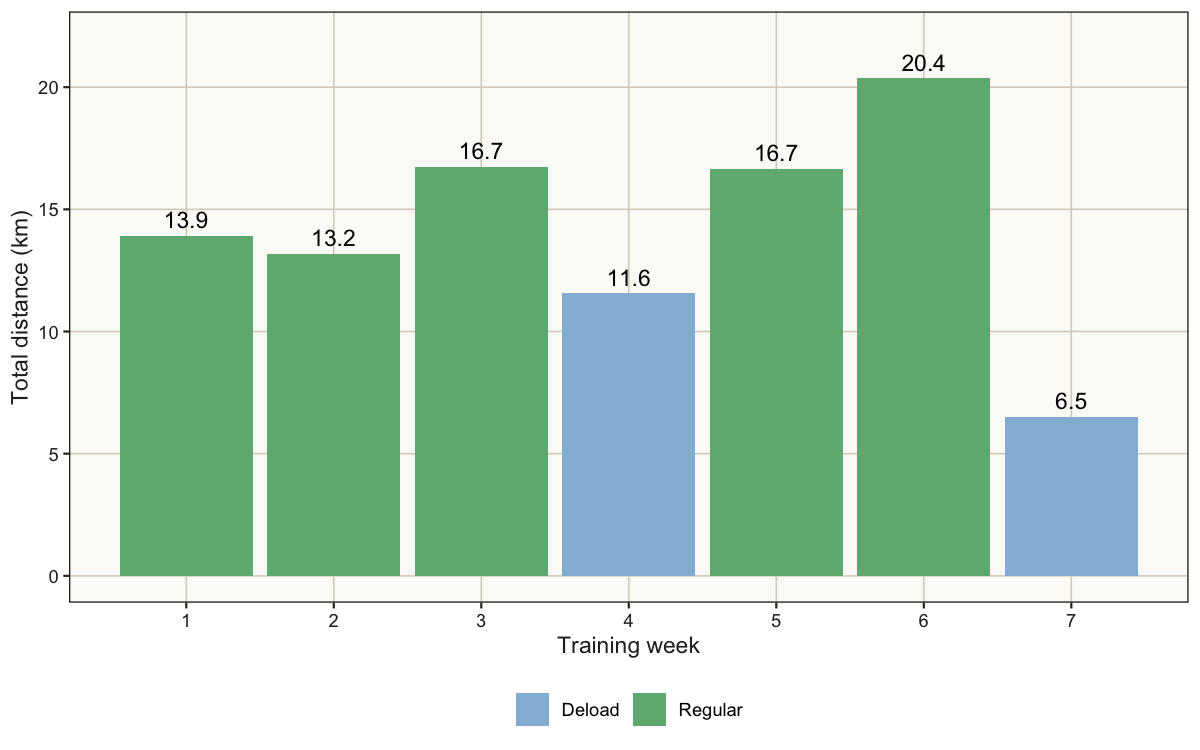
This was the first pattern that addressed my question directly.
Pace had not changed much, but the amount of running at that pace had. Week 6 had been hard. One session was an 11-kilometre long run; the other was a demanding hill workout covering more than 9 kilometres, including twelve one-minute high-intensity uphill efforts. Individually, neither looked absurd. Together, they formed the largest week of the programme so far.
Week 6 was my first week above 20 kilometres. That is 22% more than week 5, immediately after a 44% increase following the deload week.
Weekly distance was the variable I had been looking for. It did not measure fatigue directly, but it captured the recent increase in training volume far better than any individual run could.
That gave me a plausible explanation for the fatigue I experienced over the following days: my recent training volume may have increased faster than I could recover from it.
Enough information for a small decision
14 runs were not enough to establish that the increase in distance caused my fatigue. But that was not quite the decision I needed to make.
I felt tired, and the data showed a sharp increase in running volume. That was enough evidence for the decision at hand. I asked my running app to reduce the weekly mileage and turned week 7 into a recovery week. Regular training would resume in week 8.
I am writing these lines at the dawn of week 8. I will soon find out whether I can restart the programme as originally intended.
Take-home message
The Garmin database contained hundreds of variables, yet the most useful one was not among them. I had to combine distance, dates, and my knowledge of the programme to create weekly running volume.
That is often what feature engineering is for: building the variables that connect the available data to the question we actually want to answer.
The running data are only an example. Every dataset reflects the system that collected it, while our questions come from the problem we are trying to solve. The two will not always align. Good EDA helps us recognise that gap and decide what information is missing.
What’s next
This exploration also exposed the next problem. Average pace cannot meaningfully compare a long run, a tempo session, and hill repeats. All of them also include a warm-up and cool-down. To study progress, I will need to engineer another variable that better captures the training part of each run.
Until then.
By the way
Don’t forget to disconnect your database.
DBI::dbDisconnect(con)