
Mapping My Playground
Now that I’ve made a long-term prediction for my running time, I need to go through the training itself to see the results.
So what do I do in the meantime? My all-time favourite procrastination exercise: mapping data. Not the first I’m going down this road.
I really love making maps. Finding the right colour palette, the right scale and location for labels, or the right data to map your idea.
Here are the three views I did for these running data: a density plot of GPS positions, towers of repeat visits, and a run placed in its landscape using satellite date.
The code examples are, unfortunately, on the long side but good visuals deserve that much. I never knew how to accept pre-made figure templates. I always have to fine tune everything by hand. So be it.
Getting the coordinates
To make maps, one needs spatial data. The coordinates live in
activity_records, inside garmin_activities.db. We keep running
activities from 29 June 2026 onwards. Warm-ups and cool-downs are
included in this chapter: they are places I ran.
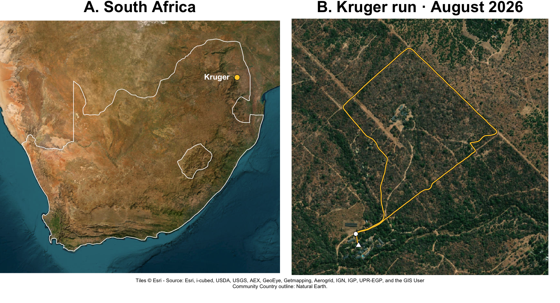
One of the runs of this period comes from a trip to South Africa to give an R workshop. A map covering South Africa and Germany would shrink the routes to dots, so that run will get its own map at the end.
Here are the data we’ll use:
position_longandposition_latlocate each point in decimal degrees.activity_idtells us which run it belongs to, andrecordgives the order of points within each run.
setwd(
    path(path_home(), "DataSharp", "enter-the-mind", "running")
)
library(DBI)
library(dbplyr)
library(dplyr)
library(fs)
library(ggplot2)
library(sf)

# Additional plotting packages used below: MASS, plot3D, and viridisLite.
file_database <- path("_inputs", "DBs", "garmin_activities.db")
programme_start <- "2026-06-29"
south_africa_activity_id <- 24169121176 # Kruger Running, 30 August 2026


con <- dbConnect(
    RSQLite::SQLite(), dbname = file_database,
    flags = RSQLite::SQLITE_RO
)


running_activities <- tbl(con, "activities") |>
    filter(sport == "running", start_time >= !!programme_start)

gps <- tbl(con, "activity_records") |>
    semi_join(running_activities, by = "activity_id") |>
    select(
        activity_id, record,
        position_long, position_lat
    ) |>
    collect()

dbDisconnect(con)
After collect() brings the selected records into R, I close the
read-only database connection. The maps can now be made from the data
already in memory.
Two records have missing coordinates at the start of an activity. I drop
rows missing either coordinate, then split the runs into Germany
(de_gps) and South Africa (sa_gps).
gps <- gps |>
    tidyr::drop_na(position_long, position_lat) |>
    arrange(activity_id, record)

# Keep the South African run separate for its own map.
sa_gps <- gps |> filter(activity_id == south_africa_activity_id)
de_gps <- gps |> filter(activity_id != south_africa_activity_id)
Choosing the neighbourhood
The main maps cover my routes around Greifswald, Germany. I use the median recorded position as the map centre.
Longitude and latitude need to be converted into distances and projected onto 30-metre squares. A local map projection converts those angles into x and y coordinates in metres. Here, zero is the chosen centre, east is right, and north is up.
st_as_sf() identifies the original coordinates as longitude and
latitude (4326);
st_transform()
converts them to the local projection. Dividing by the cell width and
applying floor() then assigns each point to a grid square.
map_centre <- c(
    lon = median(de_gps$position_long),
    lat = median(de_gps$position_lat)
)
cell_size_m <- 30
bandwidth_m <- 10

local_crs <- sprintf(
    "+proj=aeqd +lon_0=%.8f +lat_0=%.8f +datum=WGS84 +units=m +no_defs",
    map_centre[["lon"]], map_centre[["lat"]]
)
xy <- de_gps |>
    st_as_sf(coords = c("position_long", "position_lat"), crs = 4326) |>
    st_transform(local_crs) |>
    st_coordinates()

# Add the projected coordinates so we can work in metres.
de_gps <- de_gps |>
    mutate(
        x_m = xy[, "X"],
        y_m = xy[, "Y"],
        grid_x = as.integer(floor(x_m / cell_size_m)),
        grid_y = as.integer(floor(y_m / cell_size_m))
    )
map_points <- de_gps |>
    mutate(x_km = x_m / 1000, y_km = y_m / 1000)

# Leave a margin around the recorded routes.
x_limits <- range(map_points$x_km) + c(-1, 1) * 3 * bandwidth_m / 1000
y_limits <- range(map_points$y_km) + c(-1, 1) * 3 * bandwidth_m / 1000
map_theme <- theme_running() +
    theme(legend.title = element_text(), panel.grid.minor = element_blank())
This view contains 16206 GPS records from 24 runs.
Where I spent the most time
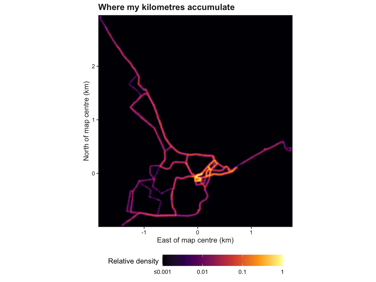
The first map we’ll make will smooth the recorded positions into a density surface.
Imagine placing a small glow around each GPS point. Where many glows overlap, the map becomes brighter. The bandwidth controls how widely each point spreads: ten metres keeps these routes sharply defined.
The inferno palette runs from dark to bright yellow. So I choose to map my data density to this scheme, scaling data from 0 (black; never been there) to 1 (yellow; highest density). However, I first log-transformed the data to ensure the road I used only once or twice do net get lost in the background.
density_floor <- 1e-3
density_map <- ggplot(map_points, aes(x_km, y_km)) +
    stat_density_2d(
        aes(fill = after_stat(pmax(ndensity, density_floor))),
        geom = "raster", contour = FALSE, n = 500,
        # MASS::kde2d divides h by four internally.
        h = rep(4 * bandwidth_m / 1000, 2)
    ) +
    scale_fill_viridis_c(
        option = "inferno", limits = c(density_floor, 1), transform = "log10",
        breaks = c(0.001, 0.01, 0.1, 1),
        labels = c("≤0.001", "0.01", "0.1", "1"),
        guide = guide_colourbar(barwidth = grid::unit(65, "mm"))
    ) +
    scale_x_continuous(limits = x_limits, expand = c(0, 0)) +
    scale_y_continuous(limits = y_limits, expand = c(0, 0)) +
    coord_equal() +
    labs(
        title = "Where my kilometres accumulate",
        x = "East of map centre (km)", y = "North of map centre (km)",
        fill = "Relative density\n"
    ) + map_theme
density_map
The brightest patch near the origin corresponds to the one usable hill in my neighbourhood. Those hill repetitions have left quite a signature. This colour scheme of this plot may equally be interpreted as the amount of sweat lost in each location 🥵
Turning visits into height
Now, I want to plot something slightly different: how many times I used each segment. So I want to exclude the pace element – if I walk on that section, I’ll spend more time there, automatically increasing the brightness on the plot above.
Counting everytime I entered a location
Counting entries into grid cells will thus reduce the influence of resting in one place.
I divide the whole area into 30-by-30-metre squares and count entries. The sequence A, A, B, B, A gives two visits to cell A and one to B. Staying inside a cell (A -> A) does not keep adding visits, and every new activity starts its own sequence.
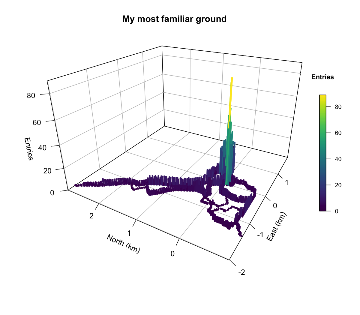
The largest entry counts cluster near the origin, around that hill. This time, the numbers describe how many times I returned to those squares, rather than how many GPS points accumulated there.
visits <-
    de_gps |>
        group_by(activity_id) |>
        arrange(record, .by_group = TRUE) |>
        mutate(
            new_visit = row_number() == 1L |
                grid_x != lag(grid_x) | grid_y != lag(grid_y)
        ) |>
        ungroup() |>
        filter(new_visit)

cell_counts <- visits |>
    count(grid_x, grid_y, name = "entries")

cell_counts |> arrange(desc(entries))
## # A tibble: 848 × 3
##    grid_x grid_y entries
##     <int>  <int>   <int>
##  1     -1     -3     121
##  2      0     -2     116
##  3      1     -2     113
##  4     -1     -2     112
##  5     -2     -3      74
##  6      0     -4      73
##  7      1     -4      71
##  8      2     -1      71
##  9     -2     -4      60
## 10      1     -5      52
## # ℹ 838 more rows
My most visited segment tallies ~120 visits. This corresponds to the beginning and end of the “hill loop” I keep doing over and over. So Each loop brings two entries. So I can roughly estimate that I have ran up that hill about ~60 times since the beginning of that program across 5-6 sessions.
Gridding the data
plot3D::hist3D() needs a rectangular matrix: x cells in rows, y cells
in columns, and entry counts inside. complete() adds every cell
between the smallest and largest indices, including entirely unvisited
rows and columns. pivot_wider() then spreads the y indices across
columns.
The + 0.5 below moves from a cell’s edge to its centre. For example,
cell 0 spans 0–30 metres and has its centre at 15 metres. Division by
1,000 gives the plot axes in kilometres.
# hist3D expects rows along x and columns along y, including empty cells.
entry_grid <- cell_counts |>
    tidyr::complete(
        grid_x = seq(min(grid_x), max(grid_x)),
        grid_y = seq(min(grid_y), max(grid_y)),
        fill = list(entries = 0)
    ) |>
    tidyr::pivot_wider(
        names_from = grid_y,
        values_from = entries,
        names_sort = TRUE
    ) |>
    arrange(grid_x)

x_centres_km <- (entry_grid$grid_x + 0.5) * cell_size_m / 1000
y_centres_km <- (as.numeric(names(entry_grid)[-1]) + 0.5) * cell_size_m / 1000

entry_matrix <- entry_grid |>
    select(-grid_x) |>
    as.matrix()
Each occupied square becomes a column. Twenty entries make a column twice as tall as ten resulting in an elevation-like plot: each rectangle describes how many times I entered that grid cell.
plot3D draws this as a static figure, ready to include in the notebook.
thetarotates the view around the “z-axis”, that is the vertical dimension.phichanges the viewing angle above it - a value of 90 gives a bird-s eye view, and a value of 0 would look at the data from teh ground. A little fiddling helps keep the tallest columns from hiding everything behind them.
# Equal horizontal axis spans keep the ground-plane grid square.
horizontal_span <- max(diff(range(x_centres_km)), diff(range(y_centres_km))) +
    cell_size_m / 1000
plot3D::hist3D(
    x = x_centres_km, y = y_centres_km,
    z = replace(entry_matrix, entry_matrix == 0, NA_real_), # Hide empty cells.
    colvar = entry_matrix, col = viridisLite::viridis(100),
    clim = c(0, max(entry_matrix)), zlim = c(0, max(entry_matrix)), zmin = 0,
    xlim = mean(range(x_centres_km)) + c(-0.5, 0.5) * horizontal_span,
    ylim = mean(range(y_centres_km)) + c(-0.5, 0.5) * horizontal_span,
    space = 0.15, border = NA, shade = 0,
    theta = -60, phi = 25, expand = 0.65,
    ticktype = "detailed", bty = "b2",
    xlab = "East (km)", ylab = "North (km)", zlab = "Entries",
    clab = "Entries", main = "My most familiar ground",
    colkey = list(length = 0.5, width = 0.6, cex.axis = 0.8, cex.clab = 0.9)
)
It is funny how this plots is similar to big city density plots, with the center hosting the highest density and then decreasing along the main roads.
PS: I can’t explore in too many directions because I live on a peninsula. Lots of Baltic Sea in the top right triangle.
A detour to South Africa
One of the runs was done in South Africa and does not really belong to his program. It was a chance to shake off some of the travelling aches that one gets staying 11+ hours on a plane. And while I would have liked to repeat such a bush run experience a few more times, daily reports of fresh leopard prints on the roads we had used cooled our enthusiasm.
So the experience was not repeated 😅
Using satellite imagery as background
The maptiles package downloads
small image tiles and joins them into a background. Here we use Esri
World Imagery, which needs no API key for this example. terra
displays the image and rnaturalearth supplies the country outline.
install.packages(c("maptiles", "terra", "rnaturalearth", "rnaturalearthdata"))
Put the route and the background in the same coordinates
All layers need the same coordinate system to line up. These tiles use Web Mercator (EPSG:3857), so the GPS points and country outline are transformed to match.
A bounding box gives the left, right, bottom, and top limits of a map. The overview covers South Africa. For the close-up, the route’s bounding box becomes a square with a little space around it.
sa_route <-
    sa_gps |>
        arrange(record) |>
        st_as_sf(coords = c("position_long", "position_lat"), crs = 4326) |>
        st_transform(3857)

sa_xy <- st_coordinates(sa_route)

south_africa <- rnaturalearth::ne_countries(
    country = "South Africa", scale = 50, returnclass = "sf"
) |> st_transform(3857)

# Country overview: include the coastline and a little surrounding space.
overview_area <- st_as_sfc(st_bbox(
    c(xmin = 15, ymin = -36, xmax = 34, ymax = -21),
    crs = st_crs(4326)
)) |> st_transform(3857)

# Close-up: a square around the route, with room on every side.
run_bbox <- st_bbox(sa_route)
run_centre <- c(
    x = mean(run_bbox[c("xmin", "xmax")]),
    y = mean(run_bbox[c("ymin", "ymax")])
)
half_width <- max(
    run_bbox[["xmax"]] - run_bbox[["xmin"]],
    run_bbox[["ymax"]] - run_bbox[["ymin"]]
) * 0.65
closeup_area <- st_as_sfc(st_bbox(
    c(
        xmin = run_centre[["x"]] - half_width,
        ymin = run_centre[["y"]] - half_width,
        xmax = run_centre[["x"]] + half_width,
        ymax = run_centre[["y"]] + half_width
    ),
    crs = st_crs(3857)
))
Download two backgrounds
I used the maptiles package to download the data and the zoom
parameter can be used to control the level of detail in the downloaded
imagery. The country overview needs much less detail than the close-up.
crop = TRUE trims each background to its requested area;
project = FALSE keeps the tiles in Web Mercator, matching our
transformed coordinates.
imagery_provider <- "Esri.WorldImagery"
# Reuse downloaded tiles when knitting again in the same R session.
imagery_cache <- getOption("running.imagery_cache", fs::path(tempdir(), "running-tiles"))
dir_create(imagery_cache)

overview_tiles <- maptiles::get_tiles(
    overview_area, provider = imagery_provider, zoom = 6,
    crop = TRUE, project = FALSE, cachedir = imagery_cache
)
closeup_tiles <- maptiles::get_tiles(
    closeup_area, provider = imagery_provider, zoom = 17,
    crop = TRUE, project = FALSE, cachedir = imagery_cache
)
The first download needs an internet connection; cached tiles can be reused within the R session. The imagery may come from a different date than the run.
Draw the two panels
par(mfrow = c(1, 2)) makes one row of two plots. A dot locates the run
on the overview. The close-up draws each route segment twice: a thick
dark line underneath a thinner yellow one. That outline keeps the route
visible against changing backgrounds. A circle marks the start, a
triangle the finish.
par(mfrow = c(1, 2), mar = c(0, 0, 2, 0), oma = c(3, 0, 0, 0))

terra::plotRGB(overview_tiles, axes = FALSE, mar = c(0, 0, 2, 0))
plot(st_geometry(south_africa), add = TRUE, border = "white", lwd = 1.2)
points(run_centre[["x"]], run_centre[["y"]], pch = 21,
       bg = "#FFCC33", col = "#202020", cex = 1.6)
text(run_centre[["x"]], run_centre[["y"]], labels = "Kruger",
     pos = 2, offset = 0.8, col = "white", font = 2)
mtext("A. South Africa", cex=2, side = 3, line = 0.5, font = 2)

terra::plotRGB(closeup_tiles, axes = FALSE, mar = c(0, 0, 2, 0))
lines(sa_xy, col = "#202020", lwd = 4)
lines(sa_xy, col = "#FFCC33", lwd = 2)
points(sa_xy[c(1, nrow(sa_xy)), , drop = FALSE],
       pch = c(21, 24), bg = "white", col = "#202020", cex = 1.3)
mtext("B. Kruger run · August 2026", cex=2, side = 3, line = 0.5, font = 2)

imagery_credit <- paste(maptiles::get_credit(imagery_provider),
                        "Country outline: Natural Earth.")
mtext(paste(strwrap(imagery_credit, width = 130), collapse = "\n"),
      side = 1, outer = TRUE, line = 0.6, cex = 0.65)
A memorable start to SASQUA 2026. And I guess we weren’t wrong to be cautious:

What’s next?
I think I’ve reached the end of what I wanted to show with these running data. Now I need to grind a little longer to accumulate mileage. When I get closer to the race day at the end of November, I’ll make a better prediction of my race time, compare it with the original prediction and see if my simple model was sufficiently accurate.
In the meantime, I’m working on a new theme that I will soon share with you.
Stay sharp, Manuel