
The five miles I never ran
Running notebook: Investigation progress
- Building a reproducible route from Garmin to R
- Engineering variables that represent the question
- Classifying laps as warm-up, workout, or cool-down
In this post:
- Put observations on a common scale, and ask what still makes them different.
- Build a prediction from a fitted trend, making its assumptions explicit.
- Distinguish uncertainty in the model from uncertainty about the model.
I have a date to aim for: 28 November 2026. On that day, I want to run five miles at maximum effort.
My previous programme had a vague goal: get faster. No predefined distance or speed. It started well, but my motivation faded, some harder sessions were turned easy runs, and work trips interrupted the routine. A new programme gives me something more concrete to work towards.
Five miles feels like a good middle ground for me: five kilometres ends too quickly, while ten kilometres feels long. But I have not recorded a comparable five-mile effort during my summer programme. What do the data I have suggest I could run tomorrow, 16 September, and on 28 November?
This chapter illustrates a broader problem: the data we have rarely measure exactly what we want to predict. Before fitting anything, we have to decide which observations belong together, how to translate them into a useful measure, and what assumptions we are willing to carry into the future.
My running data will give us something concrete to work through. The five-mile times are the result, and I’ll use them for my personal practice, but the value of this chaper is, as always, in the data journey.
Recollecting the data from chapters 6 and 7
In chapter 6 and chapter 7, I extracted the running data from my GarminDB database and classified each lap. I reused that preparation here; just reran the scripts to include new data.
Three data frames carry the earlier work into this chapter:
runshas one row per running activity, with its date, session type, training week, and deload status.runs_detailedhas one row per retained timestamped measurement, joined to the activity information. Records with zero or missing speed have already been removed. Itsdistance.ycolumn contains cumulative distance at each measurement;distance.xcontains the total activity distance.laps_labelledhas one row per lap, with its start and stop times, derived features, andsegment_role:warm_up,work,cool_down, orzone_2.
The shared activity_id connects these tables. The lap timestamps let
me identify which detailed measurements belong to the workout.
Define what an observation represents
Let’s start by defining the parameters of this new study.
target_miles <- 5
target_km <- target_miles * 1.609344 # My data are in kilometres
riegel_exponent <- 1.06

# Start forecasting on the day after the latest recorded running activity.
forecast_origin <- max(runs$date, na.rm = TRUE) + 1
race_date <- as.Date("2026-11-28")
Then, I use laps_labelled to find each workout’s start and finish
times. Recovery laps inside an interval session remain part of the
workout. Zone 2 activities have no laps labelled work, so they are
automatically excluded here.
work_boundaries <-
    laps_labelled |>
        filter(segment_role == "work") |>
        group_by(activity_id) |>
        summarise(
            work_start = min(as.POSIXct(start_time, tz = "UTC")),
            work_stop = max(as.POSIXct(stop_time, tz = "UTC")),
            .groups = "drop"
        )

work_boundaries
## # A tibble: 14 × 3
##    activity_id work_start          work_stop
##    <chr>       <dttm>              <dttm>
##  1 23455199693 2026-07-02 17:29:38 2026-07-02 17:58:21
##  2 23500264729 2026-07-06 17:30:24 2026-07-06 18:00:12
##  3 23537301780 2026-07-09 17:32:57 2026-07-09 17:48:36
##  4 23583391001 2026-07-13 17:14:43 2026-07-13 17:55:54
##  5 23628587479 2026-07-17 11:22:34 2026-07-17 11:52:12
##  6 23704999674 2026-07-23 17:43:44 2026-07-23 18:00:10
##  7 23765189555 2026-07-28 17:30:23 2026-07-28 18:16:56
##  8 23802436767 2026-07-31 17:40:19 2026-07-31 18:00:50
##  9 23837759155 2026-08-03 17:09:19 2026-08-03 17:52:40
## 10 23876910123 2026-08-06 17:31:39 2026-08-06 18:10:04
## 11 23938323418 2026-08-11 17:41:00 2026-08-11 18:10:07
## 12 24011817535 2026-08-17 17:22:03 2026-08-17 17:54:54
## 13 24050158157 2026-08-20 16:47:03 2026-08-20 17:07:29
## 14 24098943670 2026-08-24 17:40:45 2026-08-24 18:01:16
I then keep the measurements from runs_detailed that fall inside those
boundaries. Each record is an individual timestamped measurement within
a lap. Ordering them makes the first and last measurements meaningful
for the distance and duration calculation.
workout_records <-
    runs_detailed |>
        transmute(
            activity_id,
            timestamp = as.POSIXct(timestamp, tz = "UTC"),
            # The chapter 6 join kept activity distance as distance.x and
            # cumulative record distance as distance.y.
            distance = distance.y
        ) |>
        inner_join(work_boundaries, by = "activity_id") |>
        filter(
            timestamp >= work_start,
            timestamp <= work_stop,
            is.finite(distance)
        ) |>
        group_by(activity_id) |>
        arrange(timestamp, .by_group = TRUE) |>
        ungroup()
Subtracting the first retained distance and timestamp from the last gives the complete workout’s distance and elapsed time. Pauses between those timestamps still count.
workout_totals <-
    workout_records |>
        group_by(activity_id) |>
        summarise(
            source_distance_km = last(distance) - first(distance),
            source_time_seconds = as.numeric(
                difftime(last(timestamp), first(timestamp), units = "secs")
            ),
            .groups = "drop"
        )

workout_totals |>
    mutate(longer_than_5miles = source_distance_km >= target_km)
## # A tibble: 14 × 4
##    activity_id source_distance_km source_time_seconds longer_than_5miles
##    <chr>                    <dbl>               <dbl> <lgl>
##  1 23455199693               4.88                1723 FALSE
##  2 23500264729               5.00                1787 FALSE
##  3 23537301780               3.00                 939 FALSE
##  4 23583391001               6.58                2224 FALSE
##  5 23628587479               4.41                1778 FALSE
##  6 23704999674               3.44                 985 FALSE
##  7 23765189555               8.01                2702 FALSE
##  8 23802436767               4.00                1230 FALSE
##  9 23837759155               7.49                2599 FALSE
## 10 23876910123               6.38                2305 FALSE
## 11 23938323418               4.22                1747 FALSE
## 12 24011817535               6.00                1971 FALSE
## 13 24050158157               3.50                1226 FALSE
## 14 24098943670               3.99                1230 FALSE
We now have one row per workout, with its distance and elapsed time. The last column checks whether any observation reaches the distance we want to predict. Checking the coverage of our data before modelling tells us whether the answer can be observed or has to be inferred.
A common scale requires an assumption
The 14 trimmed workouts range from 3.00 to 8.01 km. Five miles is 8.047 km, so none of these workouts contains the complete target distance.
That is a clear limitation of the data: I cannot extract an observed five-mile time, even from the longest workout. Every estimate below requires extrapolation.
Simply comparing finish times would mostly tell us that longer runs take longer. Comparing average paces removes that obvious difference, but still assumes that pace can be sustained over different distances.
Scaling is therefore already a modelling decision. I will make that decision explicit through two scenarios:
- Optimistic: maintain the workout’s average pace over five miles.
- Conservative: allow pace to slow as distance increases, using the Riegel power law with an exponent of 1.06 (Vickers and Vertosick, 2016).
Both start with the ratio between the target and recorded distances. The
optimistic calculation multiplies duration by that ratio; the
conservative calculation raises the ratio to riegel_exponent first.
Unlike a fixed adjustment such as “add 10%”, the power law makes the
adjustment grow with the amount of extrapolation. Extending 4.9 miles to
five changes little; extending two miles to five changes much more.
How much correction does scaling add?
To isolate the adjustment for slowing down, we can plot the percentage
added to the constant-pace estimate. With a distance ratio of $r$,
Riegel multiplies time by $r^{1.06}$ instead of $r$, so the extra
correction is $100(r^{0.06} - 1)$ percent. A fixed 10% adjustment
always adds the same percentage, whatever the distance ratio.
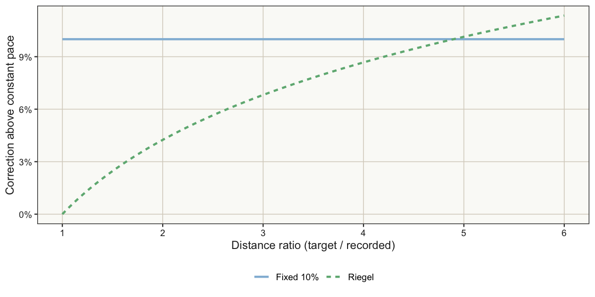
At a ratio of one, Riegel adds no correction: we already covered the target distance. At a ratio of two, it adds about 4.2%; at five, about 10.1%. The fixed adjustment stays at 10% throughout.
This is why a fixed percentage and a distance-dependent correction can give quite different answers. The fixed 10% is only an illustration here; our workout estimates below still compare constant pace with Riegel. With the latter, the runs that were close to 5-miles will be little corrected, while the short ones will be heavily corrected.
Apply the two scenarios to our workouts
five_mile_performances <-
    workout_totals |>
        left_join(
            runs |> select(activity_id, date, session_type, deload),
            by = "activity_id"
        ) |>
        mutate(
            distance_ratio = target_km / source_distance_km,
            constant_pace_seconds = source_time_seconds * distance_ratio,
            riegel_seconds = source_time_seconds * distance_ratio ^ riegel_exponent,
            constant_pace_minutes = constant_pace_seconds / 60 / target_km,
            riegel_minutes = riegel_seconds / 60 / target_km
        ) |>
        arrange(date)

five_mile_performances |>
    select(source_distance_km, distance_ratio, constant_pace_minutes, riegel_minutes)
## # A tibble: 14 × 4
##    source_distance_km distance_ratio constant_pace_minutes riegel_minutes
##                 <dbl>          <dbl>                 <dbl>          <dbl>
##  1               4.88           1.65                  5.88           6.06
##  2               5.00           1.61                  5.95           6.12
##  3               3.00           2.69                  5.22           5.54
##  4               6.58           1.22                  5.63           5.70
##  5               4.41           1.82                  6.72           6.96
##  6               3.44           2.34                  4.77           5.02
##  7               8.01           1.00                  5.62           5.63
##  8               4.00           2.01                  5.13           5.35
##  9               7.49           1.07                  5.78           5.81
## 10               6.38           1.26                  6.02           6.10
## 11               4.22           1.91                  6.90           7.18
## 12               6.00           1.34                  5.48           5.58
## 13               3.50           2.30                  5.84           6.13
## 14               3.99           2.01                  5.13           5.35
The last two columns are paces in minutes per kilometre, expressed for the same target distance. Each pair of values shows how much the estimate changes when we change the distance assumption while keeping the workout fixed.
“Conservative” is relative to the constant-pace calculation: it does not guarantee a better race forecast.
A common scale does not guarantee comparability
A plot can help us check what our transformation has achieved. If session types still form separate groups, distance was only part of what made the observations different. Colouring points by information about how they were collected is useful here: it lets us inspect differences that a single fitted line would hide.
Each workout now has two projected paces. Opaque symbols are used to show the conservative Riegel estimates; the same symbols at 50% opacity show the optimistic estimates. As usual, colours identify the session type, circles mark deload weeks, and triangles mark regular weeks. Faster paces appear higher on the chart.
The solid grey line shows a linear fit across the conservative Riegel estimates.
projection_points <-
    five_mile_performances |>
        pivot_longer(
            cols = c(riegel_minutes, constant_pace_minutes),
            names_to = "scenario",
            values_to = "projected_pace"
        ) |>
        mutate(
            scenario = factor(
                scenario,
                levels = c("riegel_minutes", "constant_pace_minutes"),
                labels = c("Conservative (Riegel)", "Optimistic (constant pace)")
            )
        ) |>
        # Draw the opaque symbol last when both scenarios coincide.
        arrange(desc(scenario))


projection_plot <-
    ggplot(
        projection_points,
        aes(
            x = date,
            y = projected_pace,
            colour = session_type,
            shape = deload,
            alpha = scenario
        )
    ) +
        geom_smooth(
            data = five_mile_performances,
            aes(x = date, y = riegel_minutes),
            inherit.aes = FALSE,
            method = "lm",
            formula = y ~ x,
            se = FALSE,
            colour = "grey40",
            linewidth = 0.8
        ) +
        geom_point(size = 6) +
        scale_shape_manual(values = c("Deload" = 16, "Regular" = 17)) +
        scale_alpha_manual(values = c(1, 0.5)) +
        scale_y_reverse() +
        scale_x_date(date_breaks = "2 weeks", date_labels = "%d %b") +
        labs(
            x = NULL,
            y = paste(target_miles, "mile projected pace (min/km)"),
            colour = "Session", shape = "Training week",
            alpha = "Scenario"
        ) +
        theme_running() +
        theme(legend.box = "vertical") +
        guides(
            colour = guide_legend(order = 1, nrow = 1,
                                 override.aes = list(shape = 16, alpha = 1)),
            shape = guide_legend(order = 2,
                                override.aes = list(alpha = 1)),
            alpha = guide_legend(order = 3)
        )

projection_plot
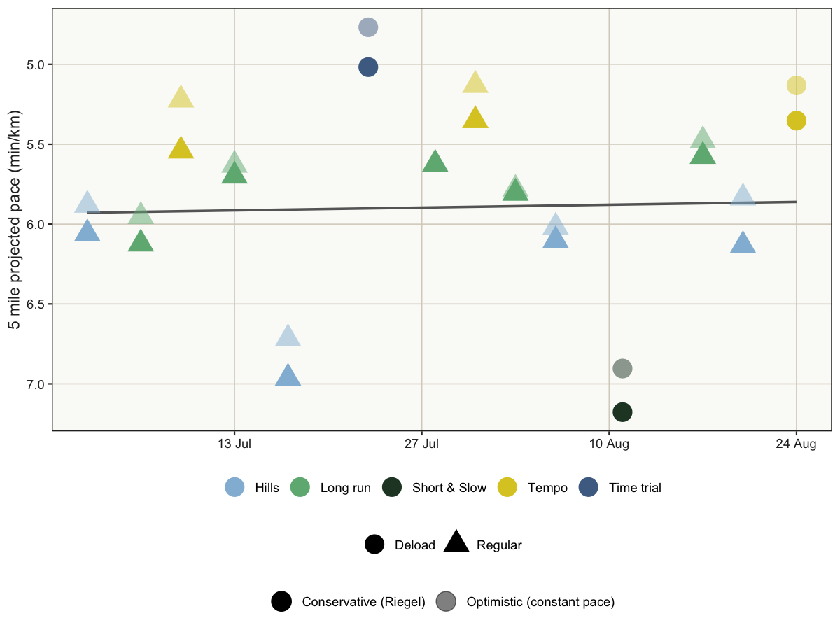
So… these results surprise me. The fitted line suggests that my projected five-mile pace barely changed over the first two months of the programme. That is not how it felt when I was running. So maybe I didn’t use the right data for my regression?
One pattern does stand out: hill sessions (light blue) tend to produce slower pace estimates than long runs (green) and tempo runs (yellow). That’s because Hill sessions include more slow running and walking than full-speed running, so their average pace mixes short, hard efforts with substantial recovery time. Their structure is wildly different from an optimal race pace. An their average pace is not really changing over time because my walking speed isn’t.
The lesson extends beyond running. Putting observations into the same units does not remove differences in how they were produced. A trend through a mixture of groups can reflect changes in the mixture as well as changes within the groups. It is quite important to avoid automatic fits like I did here. It is not because the data look similar that they are indeed.
Decide which observations can inform the forecast
For the forecast, I thus only keep long runs, tempo runs, and time
trials, which are structurally more similar to a real race. Hill
sessions and Short & Slow runs serve different training purposes, so I
leave them out of this particular comparison. The retained sessions are
still not identical, but their design is closer to the continuous,
race-like effort I want to estimate.
For those of you who made it this far and may roll their eyes here: I hear you. Arguably, we’d all prefer not to do this choices a posteriori. But we often do. The main difference is that I chose to be open about the process and to show you EVERYTHING. The good, the bad, and the ugly.
Data analysis is made of trials and errors, and while I would certainly not report this manual adjustement in a professional setting, we all do this when nobody is watching. This is not cheating; it is acknowledging that analysing data is hard, multifactorial, and non-linear.
Finally forecasting
I use the conservative Riegel estimates for the forecast and the trend discussion. They allow pace to slow when extending a shorter workout to five miles. The optimistic estimates remain on the plot for comparison.
A linear model gives us a simple starting point: an average change in pace per day. It assumes a straight relationship over the observed period. It does not establish that training caused the change, or that the same rate can continue indefinitely.
forecast_runs <-
    five_mile_performances |>
        filter(session_type %in% c("Long run", "Tempo", "Time trial"))

pace_trend_model <- lm(riegel_minutes ~ date, data = forecast_runs)
pace_change_per_day <- unname(coef(pace_trend_model)["date"])
summary(pace_trend_model)
##
## Call:
## lm(formula = riegel_minutes ~ date, data = forecast_runs)
##
## Residuals:
##     Min      1Q  Median      3Q     Max
## -0.5791 -0.1532  0.0317  0.1531  0.4080
##
## Coefficients:
##               Estimate Std. Error t value Pr(>|t|)
## (Intercept) 149.858379 134.477075   1.114    0.302
## date         -0.006984   0.006509  -1.073    0.319
##
## Residual standard error: 0.3098 on 7 degrees of freedom
## Multiple R-squared:  0.1412, Adjusted R-squared:  0.01856
## F-statistic: 1.151 on 1 and 7 DF,  p-value: 0.3189
# Compare the same scenario before and after selecting session types.
all_session_model <- lm(riegel_minutes ~ date,
                        data = five_mile_performances)
all_session_slope <- unname(coef(all_session_model)["date"])
slope_interval <- confint(pace_trend_model, "date")
summary(all_session_model)
##
## Call:
## lm(formula = riegel_minutes ~ date, data = five_mile_performances)
##
## Residuals:
##     Min      1Q  Median      3Q     Max
## -0.8840 -0.3572 -0.1489  0.2141  1.2994
##
## Coefficients:
##               Estimate Std. Error t value Pr(>|t|)
## (Intercept)  32.077245 207.063691   0.155    0.879
## date         -0.001267   0.010021  -0.126    0.901
##
## Residual standard error: 0.6235 on 12 degrees of freedom
## Multiple R-squared:  0.001331,   Adjusted R-squared:  -0.08189
## F-statistic: 0.01599 on 1 and 12 DF,  p-value: 0.9015
Across all session types, the Riegel slope is -0.0013 min/km/day (i.e. the quasi flat line we saw on the plot earlier). Across the 9 selected workouts, it is -0.0070 min/km/day, about 5 times larger.
Now the data agrees with how I felt: the fitted improvement is about 0.42 seconds per kilometre per day, or 2.9 seconds per kilometre per week for a 5 miles distance.
Expressed as a five-mile time, the fitted trend suggests an improvement of 23.6 seconds per week. If that fitted rate continued for several weeks, it would add up to useful progress.
However, it is an uncertain trend. The slope’s 95% confidence interval runs from -0.0224 to 0.0084 min/km/day and includes zero. Although less likely, these few sessions are also compatible with no improvement at all 🥲.
A slope estimate and evidence for a trend are different things. The model has to return a best-fitting line even when the observations do not clearly distinguish improvement from ordinary variation. We’d need more data to confidently separate those possibilities.
Despite the uncertainties around my progress estimates, we can still make projections. Nothing ever stops you from making projections. But your interpretations and communication around these projections must, however, reflect these uncertainties.
What does that imply for tomorrow and race day?
The slope summarises the fitted change in my Riegel-estimated five-mile
pace over the summer. To forecast a pace at a particular date, I also
need the line’s starting level. predict() uses both the slope and
intercept of pace_trend_model.
Extending that line makes a new assumption: the relationship estimated in the summer remains useful on the forecast date. The calculation is straightforward; the assumption becomes harder to defend as we look further ahead.
I request a prediction interval because I want to describe another observation, which can vary around the line. A confidence interval for the mean fitted pace would answer a narrower question and would not include that additional variation. The predicted interval also accounts for the residual variance of the data, thus making it a better representation of the range of my future runs.
forecast_dates <- tibble(
    occasion = c("Tomorrow", "Race day"),
    date = c(as.Date("2026-09-16"), race_date)
)

predictions_conf <- predict(
    pace_trend_model,
    newdata = forecast_dates,
    interval = "confidence",
    level = 0.95
)

predictions_conf
##        fit      lwr      upr
## 1 5.212570 4.397073 6.028067
## 2 4.702762 2.785576 6.619948
predictions <- predict(
    pace_trend_model,
    newdata = forecast_dates,
    interval = "prediction",
    level = 0.95
)

predictions
##        fit      lwr      upr
## 1 5.212570 4.116294 6.308846
## 2 4.702762 2.650351 6.755173
Here, fit is the predicted pace in minutes per kilometre; lwr and
upr are its prediction limits. Multiplying by the target distance
converts each to a five-mile time.
five_mile_forecasts <-
    bind_cols(forecast_dates, as_tibble(predictions)) |>
        mutate(
            finish_minutes = fit * target_km,
            lower_minutes = lwr * target_km,
            upper_minutes = upr * target_km,
            days_beyond_data = as.integer(date - max(forecast_runs$date))
        )
| Forecast | Date | Pace (min/km) | Five miles (min:sec) | 95% range (min:sec) |
|---|---|---|---|---|
| Tomorrow | 16 Sep 2026 | 5:13 | 41:57 | 33:07–50:46 |
| Race day | 28 Nov 2026 | 4:42 | 37:51 | 21:20–54:21 |
Under the conservative Riegel scenario, the fitted line gives 41:57 for five miles tomorrow, at 5:13 min/km. Continuing the same trend to 28 November gives 37:51, at 4:42 min/km.
The lower end of the November range reaches 2:39 min/km. Apparently, the model has bigger ambitions than I do–this is way beyond the world record of the distance. The range also includes performances slower than my late-July run of 8.01 km.
Those extremes show how little precision this forecast offers. A model can produce a precise-looking time to the second without providing a precise prediction.
We shall evaluate the model in a few weeks after I complete my race.
Which uncertainties did we actually measure?
I now have a numerical baseline and a date to check it against. It was easy enough to calculate the numbers. Making them reliable is a different matter.
The wide prediction ranges include uncertainty in the fitted line and the variation expected for another workout-derived observation under the model’s assumptions. These ranges describe variation around the fitted Riegel trend. The optimistic and conservative distance-conversion scenarios are separate assumptions, not the endpoints of those ranges.
It helps to separate three sources of uncertainty:
- Distance conversion: changing the scaling assumption changes each five-mile estimate. Our two scenarios illustrate this sensitivity; they do not cover every possible conversion.
- The fitted trend and the next observation: the prediction intervals quantify these uncertainties, conditional on the linear model’s assumptions and the selected data.
- Whether the model remains appropriate: our calculations do not quantify changes in training, conditions, or the relationship between workout pace and race effort.
That last category may matter more than the uncertainty we have calculated. Will I follow the new programme consistently? Will my progress flatten? How will terrain, weather, and an all-out race effort compare with these training sessions? The model does not and cannot answer those questions.
The further I project, the more uncertain the result becomes. The fitted November pace is 4:42 min/km, but its surrounding range is very wide, as I am projecting 96 days beyond the last selected workout, using a trend estimated over just 49 days.
The practical question is what I can use these numbers for. They give me a baseline to revisit as new runs arrive. They do not yet give me a well-supported race target. I will check future comparable workouts against the forecasts, including their ranges, rather than judging the model by whether its point estimate looks encouraging.
On 28 November, I will finally have a five-mile result to compare with the five miles I inferred here. One race will not validate the whole method, but it will give me something this analysis currently lacks: a direct observation of the performance I wanted to predict.
In the meantime, stay sharp with your data.